
In a digital world full of distractions, users do not want to work hard to understand a website. They want a smooth, fast, and clear experience that helps them find what they need without confusion. This is one of the main reasons minimalist web design has become so effective. A clean and focused website does not just look modern — it also improves usability, builds trust, and increases conversions.
Minimalism in web design is more than a visual trend. It is a strategic approach that removes unnecessary elements and gives users a clear path toward action. Whether that action is making a purchase, filling out a contact form, booking a service, or exploring your content, minimal design helps users stay focused and move forward with confidence.
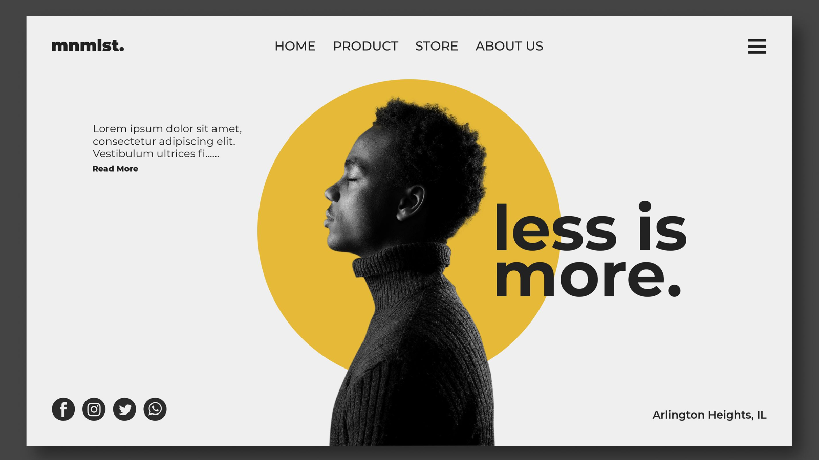
What Is Minimalism in Web Design?
Minimalism in web design is the practice of using only the most essential design elements to communicate clearly and effectively. It focuses on simplicity, structure, readability, and functionality. Instead of adding too many graphics, colors, animations, or text blocks, minimalist websites use clean layouts, white space, strong typography, simple navigation, and purposeful content.
The goal is not to make a website look empty. The goal is to make it feel clear, intentional, and easy to use.
A minimalist website often includes:
- Clean layout structure
- Limited color palette
- Clear headings and readable text
- Strong call-to-action buttons
- Plenty of white space
- Simple navigation
- Optimized visuals
- Fast-loading pages
When used correctly, this style improves both design quality and business performance.
Why Minimalist Web Design Performs Better
Many businesses assume that adding more design elements, more content, and more visual effects will make their website more impressive. In reality, too much clutter often creates confusion. When users are overwhelmed by choices or distracted by unnecessary information, they are less likely to take action.
Minimalist web design performs better because it reduces friction. It guides users toward key information and makes decision-making easier. A clean interface helps users trust the brand, understand the offer, and move through the site more naturally.
This is why many high-converting websites use minimalist principles even if their overall style is bold or premium.
Improves User Experience
User experience plays a major role in website performance. If a website is difficult to navigate, hard to read, or visually overwhelming, visitors may leave quickly. Minimalism improves user experience by making the interface cleaner and easier to understand.
With fewer distractions, users can focus on what matters most. Important sections such as services, benefits, contact details, and calls to action become easier to notice. Navigation feels simpler, and content becomes more readable.
A website that feels effortless to use creates a stronger first impression and encourages visitors to stay longer.
Reduces Distractions and Increases Focus
One of the biggest strengths of minimalist design is its ability to direct attention. Every page should have a purpose, and every section should support that purpose. When too many elements compete for attention, users may not know where to look or what to do next.
Minimalism solves this by removing unnecessary clutter and highlighting the most important actions. A clear hero section, a strong headline, one primary call to action, and well-organized supporting content can lead users toward conversion more effectively than a busy page filled with competing messages.
In conversion-focused design, clarity often wins over complexity.
Builds Trust and Professionalism
A clean website often feels more professional, modern, and reliable. Visitors tend to associate simplicity and structure with quality. If a website looks outdated, overloaded, or inconsistent, it may create doubt about the business behind it.
Minimalist design builds trust by presenting information in a polished and confident way. It shows that the brand values clarity, attention to detail, and user comfort. Clean layouts, consistent typography, and balanced spacing all contribute to a more credible online presence.
For service businesses, agencies, consultants, and professional brands, trust is a major factor in conversion. A minimal website supports that trust from the first visit.
Makes Content Easier to Understand
Content is a key part of every website, but even good content can be ignored if it is poorly presented. Minimal design improves content readability by using better spacing, clear headings, short paragraphs, and strong visual hierarchy.
When users can quickly scan a page and understand the message, they are more likely to continue reading and engage with the content. This is especially important for service pages, landing pages, product pages, and blog content.
Minimalism helps your message stand out by removing everything that does not support it.
Improves Mobile Experience
Today, a large portion of website traffic comes from mobile devices. A cluttered website may be difficult to use on smaller screens, leading to poor engagement and higher bounce rates. Minimalist design works well on mobile because it focuses on simplicity, clean layouts, and essential content.
Mobile users want fast access to information, easy navigation, and clear actions. Minimal design naturally supports these expectations by reducing visual overload and keeping the interface clean. This leads to a better user experience across all devices.
A website that performs well on mobile is far more likely to convert visitors into leads or customers.
Supports Faster Loading Speed
Website speed is directly connected to user satisfaction and conversions. Slow websites frustrate visitors and can cause them to leave before even seeing the content. Minimalist websites often load faster because they use fewer heavy elements, cleaner code structures, and more focused design assets.
Reduced use of oversized graphics, unnecessary animations, and cluttered elements helps improve page speed. Faster loading times support better user experience, lower bounce rates, and improved search visibility.
A clean design is not just visually effective — it is often technically stronger as well.
Creates Stronger Calls to Action
A website converts when users clearly understand what action to take next. Minimalist design makes calls to action more effective by removing distractions around them. When a page is clean and focused, buttons such as “Get Started,” “Contact Us,” “Book a Consultation,” or “Request a Quote” become more visible and more meaningful.
If every section is trying to push multiple actions at once, users may hesitate. But when the design supports one clear path, conversions often improve.
Minimalism helps businesses create better visual focus around important actions, which is essential for lead generation and sales.
Strengthens Brand Identity
Minimal web design can also make a brand feel more refined and memorable. By using a focused color palette, clean typography, intentional imagery, and consistent layout patterns, businesses can create a strong visual identity without overwhelming the user.
A minimalist website gives more room for the brand voice, message, and core value proposition to shine. Instead of hiding behind too many effects, the brand presents itself with clarity and confidence.
This approach works especially well for modern businesses, digital agencies, creative brands, consultants, tech companies, and premium service providers.
Helps Conversion Rates Over Time
Conversions are not driven by design alone, but design has a major influence on how users behave. A minimalist website improves many of the factors that support conversion, including readability, usability, page speed, navigation, trust, and clarity.
When users can quickly understand what your business offers and how to take action, they are more likely to convert. This is why minimalist design often supports better conversion rates over time, especially when combined with good content, strong offers, and smart user flow.
Minimalism does not mean removing strategy. It means making strategy easier to experience.
Common Features of High-Converting Minimal Websites
Businesses looking to apply minimalist design should focus on the elements that improve clarity and performance. Some of the most effective features include:
Clear Headlines
Every page should communicate its purpose quickly and simply.
Focused Layouts
Each section should support a single objective and avoid unnecessary clutter.
Strong White Space
Proper spacing improves readability and gives important content room to breathe.
Simple Navigation
Visitors should be able to find what they need without confusion.
Limited Color Use
A controlled color palette helps highlight important elements more effectively.
High-Quality Visuals
Use fewer visuals, but make sure they are relevant, sharp, and purposeful.
Consistent Typography
Readable fonts and clean hierarchy improve the content experience.
Strong CTA Placement
Calls to action should be visible, clear, and strategically placed.
Minimalism Does Not Mean Boring
Some businesses worry that a minimalist website may feel too plain. But minimalism is not about removing personality. It is about creating a cleaner structure so the right message, visuals, and brand identity stand out more effectively.
A minimalist website can still be bold, creative, premium, and visually impressive. The difference is that every element has a purpose. Instead of trying to say everything at once, the design communicates the most important things clearly.
This makes the experience better for users and more effective for the business.
Best Use Cases for Minimalist Web Design
Minimalist design works well for many industries and business types, especially those that value trust, clarity, and modern presentation. It is especially effective for:
- Digital marketing agencies
- Web design and development companies
- Consulting firms
- Startups
- Personal brands
- Professional service providers
- SaaS companies
- Creative studios
- Portfolio websites
- Luxury and premium brands
These types of businesses often benefit from a strong first impression and a clean, conversion-focused experience.
Final Thoughts
Minimalism in web design is not just about aesthetics. It is a practical and effective strategy for improving user experience, building trust, and increasing conversions. By removing distractions and focusing on clarity, minimalist websites help visitors understand your message faster and take action more confidently.
A clean website is easier to navigate, easier to read, and often easier to trust. That is why minimalist web design continues to perform well across industries and why many high-converting websites follow its principles.
If your goal is to create a website that looks modern, feels professional, and converts better, minimalism is one of the smartest design approaches you can choose

Leave a comment